on
Incumbency and Expert Predictions
This blog is part of a series related to Gov 1347: Election Analytics, a course at Harvard University taught by Professor Ryan D. Enos.
This week we looked at the effect of incumbency on models’ predictions. We compared and contrasted various pollsters and expert models to see which generated the most accurate predictions, which I will continue to look at through visualizations in this blog.
Last week, we looked at national data from generic ballot polls which gave us a general sense of political sentiment across the nation. While this data can be a good indicator for predicting elections, this week we are using more detailed, district-specific polling that gets into the strength of voter preferences. This data I expect to be even more predictive than the generic ballot polls as it looks at voter preferences in regards to the candidates they are choosing between, rather than just their general feelings towards a party - which may not accurately represent voter actions once they get to the ballot box.
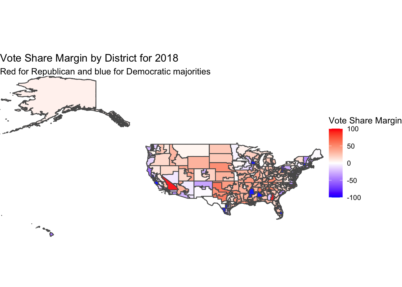
To start this analysis, I used the actual voting data from the 2018 election to create a map showing the vote share margin by district. I took the difference of republican two-party vote share minus the democrat two-party vote share percentages to get a map shaded by which states won heavily vs. were more of a toss-up. This map shows most areas in a mid-light shade of red or blue, indicating that there were not that many districts that were entirely uncontested. The size of the districts in the northeast can make the map hard to see, but we see most of the country had a vote share margin between -50 and 50. These margins are larger than the shading of the map may indicate, but we get a good sense of the contest between parties in looking at this map.
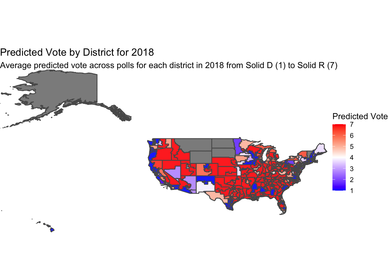
Now moving on to the map of predicted vote by district in 2018. While I originally made this map using the expert rating data and then again trying the district polling data set, I found that with both of these provided data sets there were only 135 recorded district polls for 2018. When I tried to print the maps using this data, they ended up very grey, indicating no observation for the district. From here, I went to the class Slack page to see if anyone had the same troubles as I, and found Ethan Jasny’s cleaned data set. Ethan’s data set provided observations for 435 districts, allowing us to create a more complete-looking map of polling.
While using the expert ratings and district polls data, I had wanted to incorporate multiple pollsters. The district polls data set has 167 unique pollsters in the full data set across the 2018, 2020, and 2022 election cycles. The expert rating data is more limited, with 15 pollsters represented in the dataset. However, in viewing this data, many of the pollsters included have NA values for most districts in 2018. To prevent any confounding that might result from including all 15 polls in some districts and only 4 in others, I had limited the data to only include four of the pollsters: the Cook Political Report, Inside Election’s Rothenberg report, Sabato’s Crystal Ball, and the Real Clear Politics reports. While this work can be seen in my code hidden at the bottom of my Index.Rmd, Ethan’s data followed a similar logic. The data set he created that I use below uses data from all the same pollsters, except for the Real Clear Politics report. All four of these polls are highly regarded in the world of election predictions and operate on the same scale from 1-7 with 1 being Solid Democrat and 7 being Solid Republican. As we saw and discussed in class last week, these pollsters can predict the election with accuracy in the high 90-percents, and one independent variable that contributes to this accuracy is the incumbent. Despite the use of incumbency as a predictor, and the high significance of the incumbent variable in my model from last week, in Brown (2014) we read about how despite the fact that incumbents have advantages in an election, voters do not – or very minimally – display preference for or against an incumbent. The map below shows the average score across these 3 polls on the same 1-7 scale.
Looking at the map, we see strong Democratic predictions along the west and east coasts, and scattered around some major cities in in the middle of the country. The map appears heavily red, however, as some parts of the less-populated Midwest have larger districts. Most districts across the map appear to be Solid D or Solid R, as shown by their darker hues. There are some districts that are lighter shades or white, representing a prediction of a closer election where one party only has a lean estimated vote, but as it appears here and as we know from our discussions in class, there are many districts that can be counted on going one way.
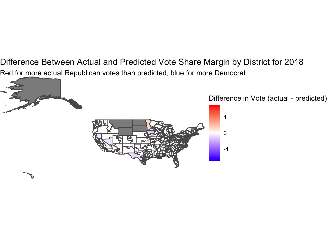
While comparing the two maps above, we can see obvious differences in the coloring, with the poll predictions having lots of darker hues and the actual vote share map showing many mid hues. This would lead us to believe that the election was more competitive than pollsters predicted. However, in the map below we will account for the difference in scales and measure the difference between the actual vote share on the 7-point scale versus the predicted vote on the 7-point scale.
I coded the 1-7 variables off of the actual vote shares for each district. For Democratic or Republican two-party vote shares greater than 56% majority, I coded these as 1 and 7 respectively, representing Solid Democrat and Solid Republican. Vote shares between 54% and 56% for each party I thought of as being likely democrat/republican, and therefore coded them as 2 and 6. Vote shares between 52% and 54% I thought of as leans for each party, and coded them as 3 and 5. Finally, vote shares between 48% and 52% I consider to be toss-ups, coding these districts as a 4.
After transforming these variables to be on the same scale as the polling predictions, I took the difference of the actual results minus the poll predicted results. This difference is depicted on the map below, which we see as being mostly white and light colors. The white represents 0 difference between the actual and predicted levels, and the significant amounts of white on the map show us that the pollsters did a good job estimating the election. The light coloring shows the places where the actual vote was more Republican (red) or Democratic (blue) than the pollsters predcited. We do not see dark colors on the map, so even when the difference was not 0, the polls were still fairly representative of the outcome.
My model from last week is built using incumbency as a factor, and it showed high significance in predicting the vote share percentage for midterm elections. While this new polling data and expert predictions can predict elections very accurately and therefore should be taken into account for a final model, I will save creating that model for next week when I have more time available to develop a meaningful model. I also believe that while weighing expert predictions in a model is likely to create an extremely accurate prediction, we do not have full transparency on the variables the experts use. This brings us back to the question of whether or not using these expert predictions in developing our own models is “cheating”, as we are not combining and weighing the independent variables ourselves in a way that makes the most sense.