on
The Air War
This blog is part of a series related to Gov 1347: Election Analytics, a course at Harvard University taught by Professor Ryan D. Enos.
This week we learned about the effect of advertising on election outcomes at the district level. There is some conflicting literature about the effects of advertising on informing, mobilizing, and persuading voters. In this blog, I will look at trends between advertising data and vote shares in previous elections, then add to my model predicting the 2022 House election.
This week we learned about how advertising can affect the outcomes of elections, with campaigns running ads on social media, radio, and television, with different goals in mind. Advertisements can be used to promote a candidate, attack the opposition, or both. Ads can also highlight important political issues for each party, from health care and abortion to taxes and government spending. While advertising campaigns do have an impact on voter knowledge and interest, we are curious if they imapct the actual results of the election in the form of who voters choose to vote for. Huber and Arceneaux (2007), find that contrary to previous research in this area, “Advertising does a little to inform, next to nothing to mobilize, and a great deal to persuade potential voters”. In analyzing this data, we can hope to find some relationships that are useful to our prediction models and good predictors for house election outcomes in each district.
To start, I will look at various advertising measurements from the 2018 election and their relationship with the vote share, specifically the Democratic vote share. In the graph below, we can look at the relationship between the difference in the number of ads run per district in 2018 (number of democratic ads minus the number of republican ads) versus the major vote percentage for democrats.

As we can see from the line of best fit, there is a slight positive relationship between these two variables. We can interpret this to mean that on average, when the difference between the amount of ads Democrats run over Republicans is greater in a district, Democrats are more likely to also have a higher major party vote percentage. While the line of best fit depicts the relationship in this way, looking at the data points we can see some heteroskedasticity. When the difference in the number of ads run is around 0, the democratic vote percentage has much more variation than when the difference in the number of ads is greater. One explanation for this pattern could be that districts where there is no competition may not have ads run on either side, thus leading to a difference in ads of 0 but vote percentages that fall on both extremes from 0-100. We can also think of the opposite phenomenon happening, in that highly competitive districts have both parties running lots of ads, leading to a difference of 0 but a vote share that falls much closer to 50, as one party edges the other out narrowly. When one party is running a lot more ads than the other, this may be a district that leans one way but is a toss up so the underdog party might try to push ads to gain the needed votes. We can see this pattern in the points that fall on the right with vote percentages right around 50, but an ad difference that is fairly high.
Below we look at a similar graph, but instead of looking at the difference in the number of ads run, we are looking at the percentage of a district’s estimated total ad costs that is spent on Democratic ads. The costs are estimated by the Wesleyan Media Project, so we must consider that there may be some noise in these estimations that is unaccounted for.
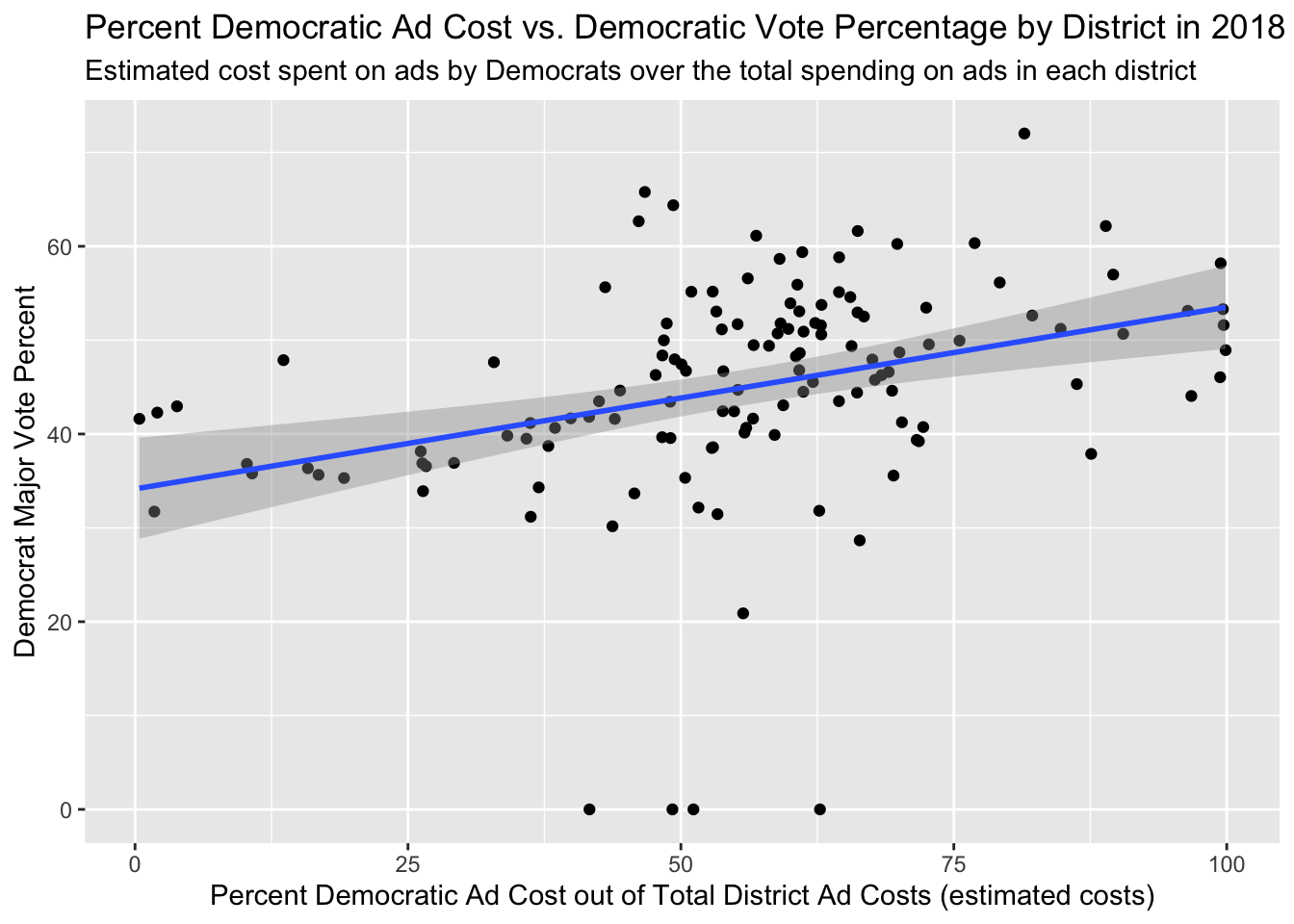
This graph shows us that there is a positive relationship between the percent of a district’s total ad cost that was spent by Democrats and the Democrat major vote percent. Here, the total ad cost for a district – that is used to calculate the percent value we see on the x-axis – is defined as the sum of estimated costs for Republican ads in a district plus the sum of estimated costs for Democratic ads in the same district. The positive relationship we see means that on average, when democrats spend a greater percentage of the district’s total ad costs, they have a higher major vote percent. In this graph we can also see that districts where democrats made up a higher percent of the district’s total ad costs were more competitive, shown by the points on the right falling close to the 50% major vote. We also can see that in districts where the percent of ad costs was split pretty evenly between democrats and republicans, there are vote shares that also fall around 50%. In these competitive districts, we can imagine that campaigning and the running of advertisements is rather important.
In terms of incorporating ad data into my final model, I do not believe I will use any of it. There are multiple pitfalls with respect to using ad data: (1) we are missing 2022 ad data, as ads are still being purchased, (2) we have a limited number of years with data we can use to create our model, and (3) the relevance of television ad data is in question, given the rise of social media and changing nature of advertisement data.
GRPs
According to Huber and Arceneaux (2007), GRPs or Gross Point Ratings are a measure of “the percentage of households viewing the show on which an advertisement was shown”. In their research, they measure advertising as the cumulative GRPs of ads in the four weeks leading up to a respondent’s interview and use the unit of GRPs/1000. In Gerber et al. (2011), the authors randomly assign the quantity of GRPs to be purchased, with either 250, 500, or 1000 GRPs. The lower GRP meant that the ad would play on a morning show or news show, and the higher GRP meant that the ad would play during a more quality entertainment such as late night entertainment or more prime-time news. GRP is very important in elections because the ad spending budget is so large, however is only impactful if people are seeing the ads – and even more importantly, if the right people are seeing the ads. In order to approximate advertising effects at either the national-level or district level, in addition to knowing how many households the ad aired to, it would also be helpful to know the demographic information of the viewers. For example, there may be a morning news show that engages a lot of working professionals, or a cable show that is watched by lots of older people. Knowing the demographic information of the channels on which the ads are played, in addition with the GRPs, would be very helpful in assessing the advertising effect on elections. This look into demographics may also be able to capture a difference between regular television users and streaming service users. Streaming services are very mainstream these days with people “cutting the cord” for ad-free television experiences. While this innately attracts households with more disposable income, we could possibly obtain even more specific demographic information on these viewers and use it to better measure the effect of advertising on people, as well as make more accurate predictions. With the prevalence of social media these days, I believe it would be fairly easy to target specific demographics with advertising. For example, we have seen Joe Biden use young influencers and pop culture celebrities on TikTok to reach a certain demographic. Using various social media platforms makes it easy to target specific people and compare voting results to a time before these targeted ads were used.